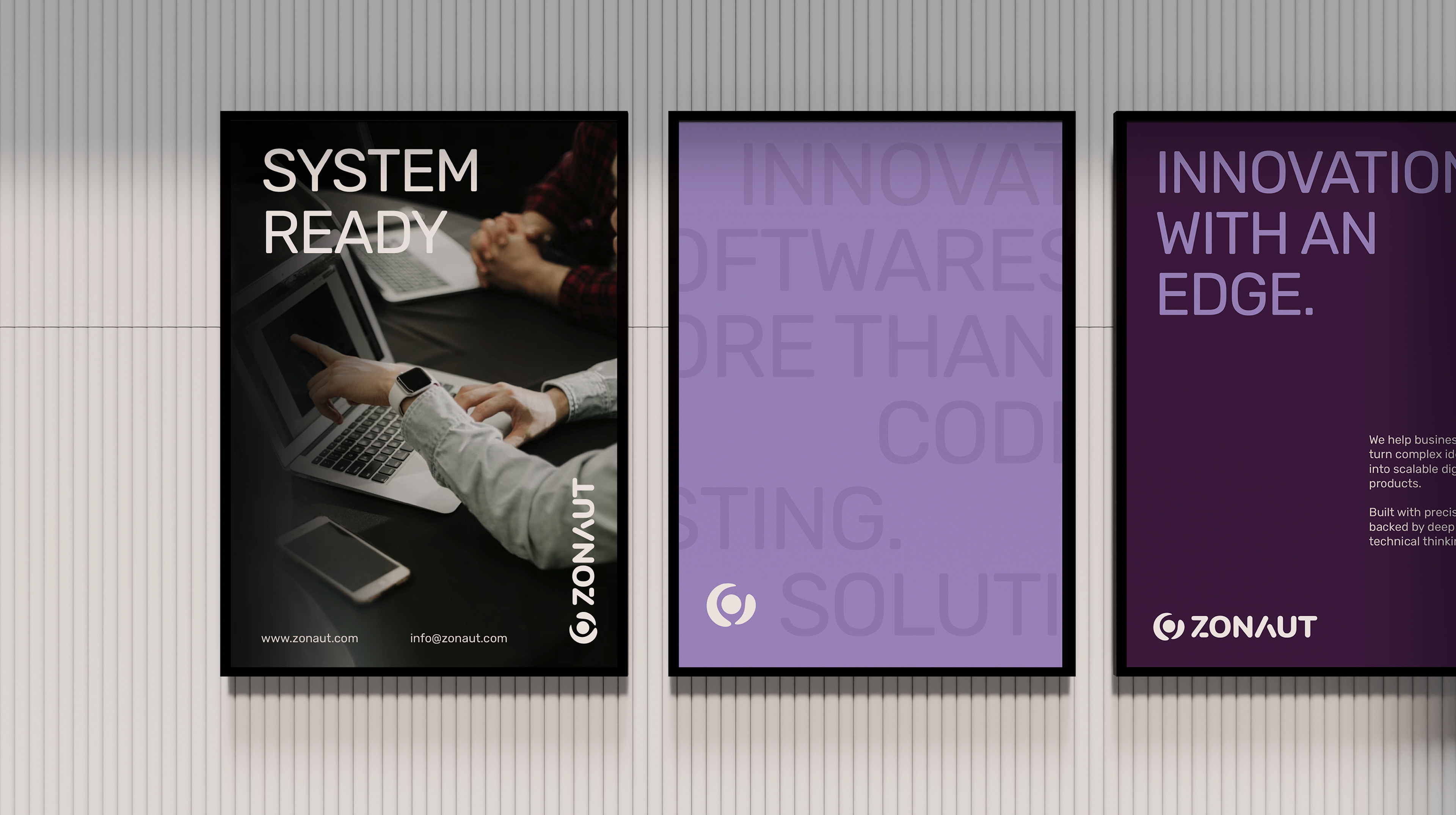
THE GOAL
Zonaut needed a brand identity that could reflect its depth in technical execution while remaining clear and approachable to business owners. The challenge was to avoid overly complex or generic "tech" visuals and instead build a system that communicates focus, precision, and innovation. The goal was to create a brand that signals trust at first glance, supports scalable growth, and positions Zonaut as a reliable partner capable of solving complex problems.
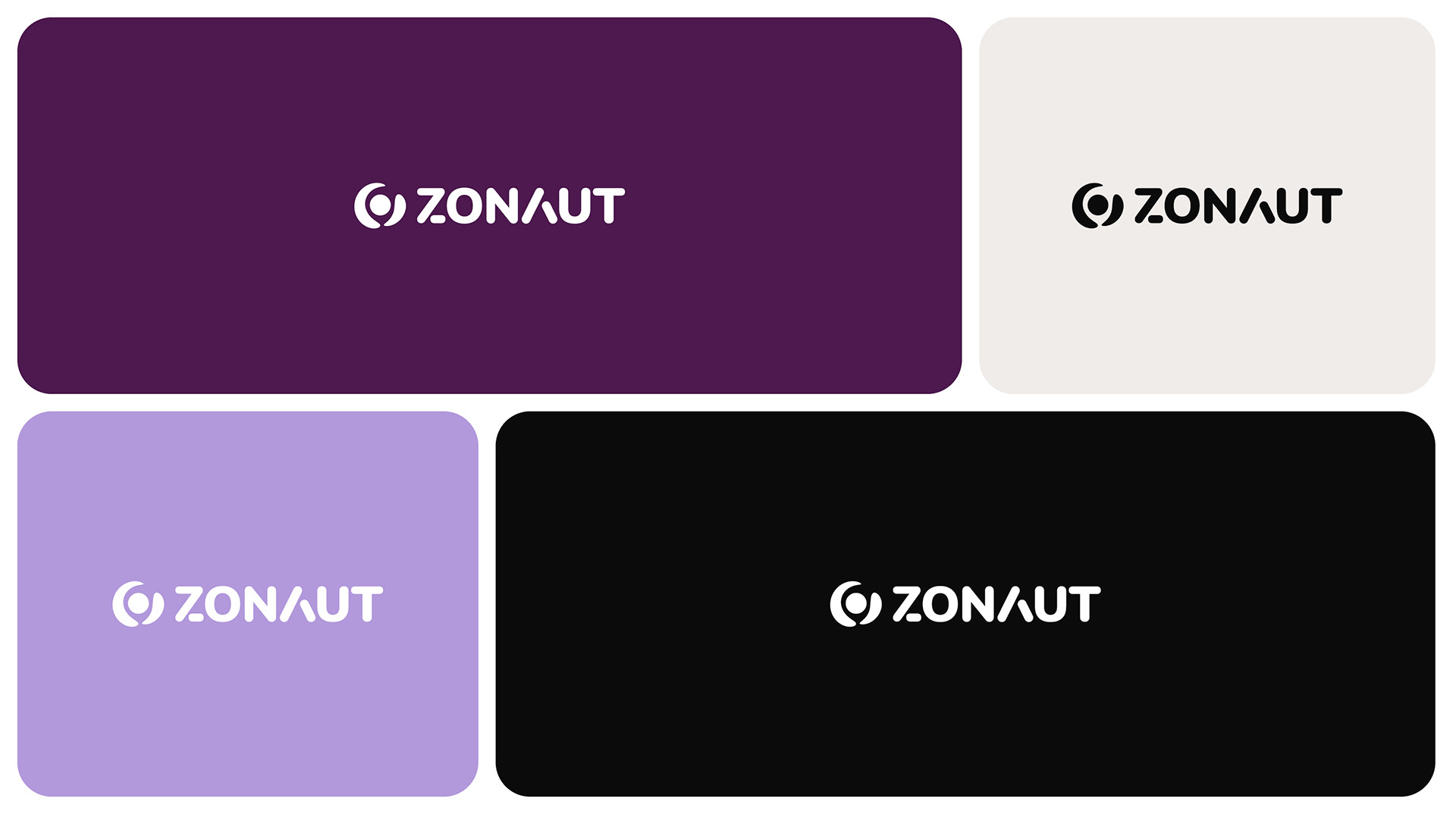
RATIONAL
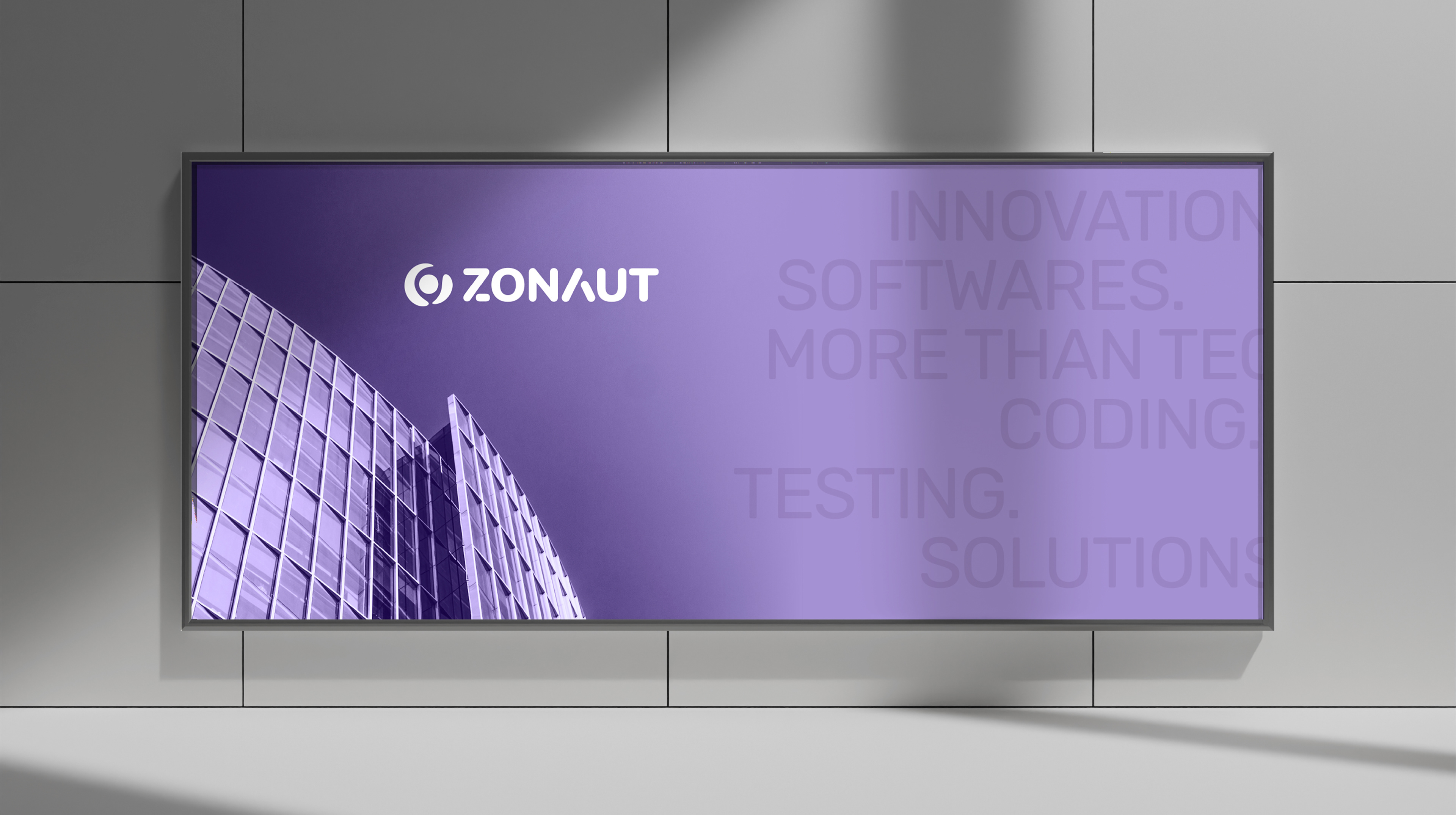
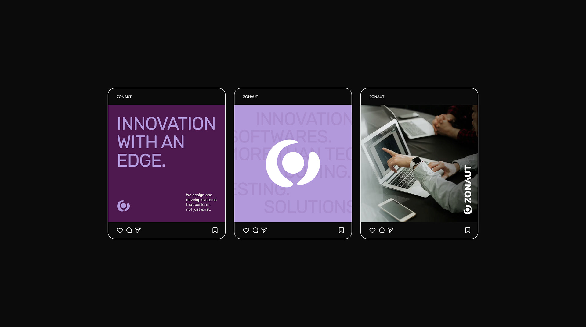
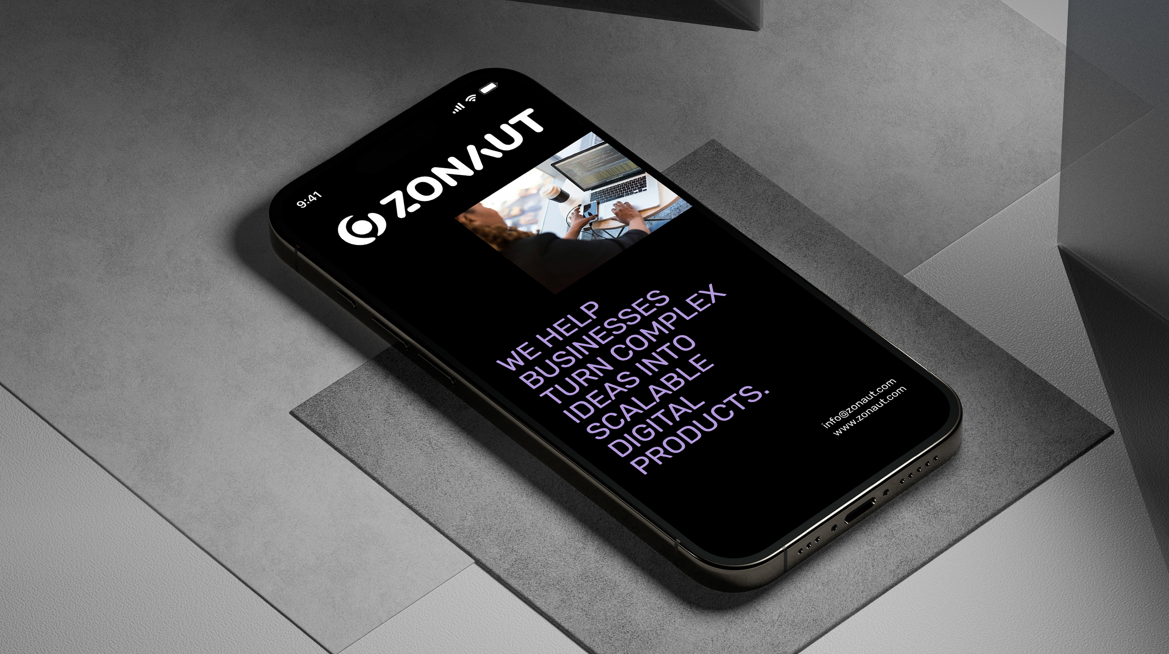
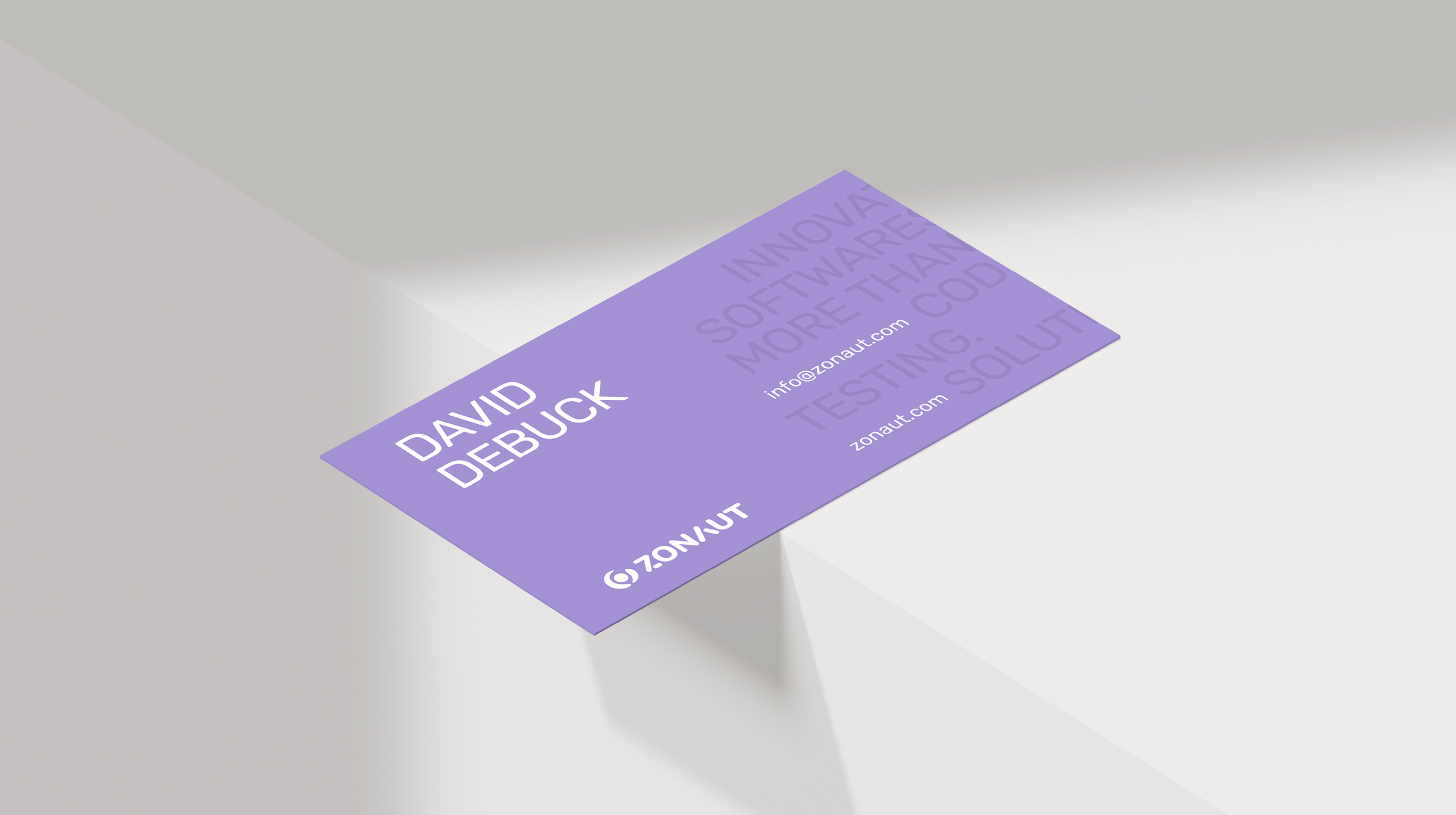
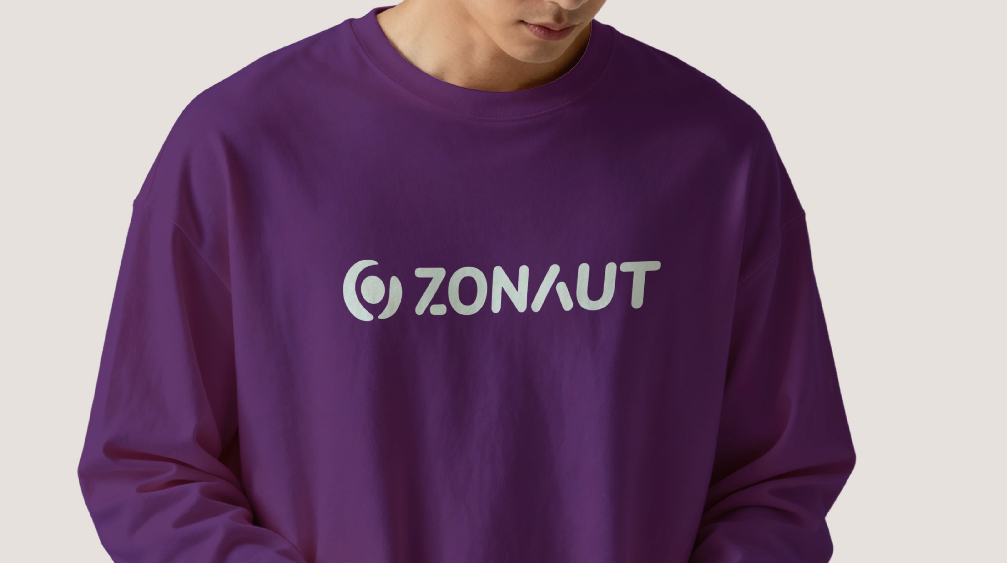
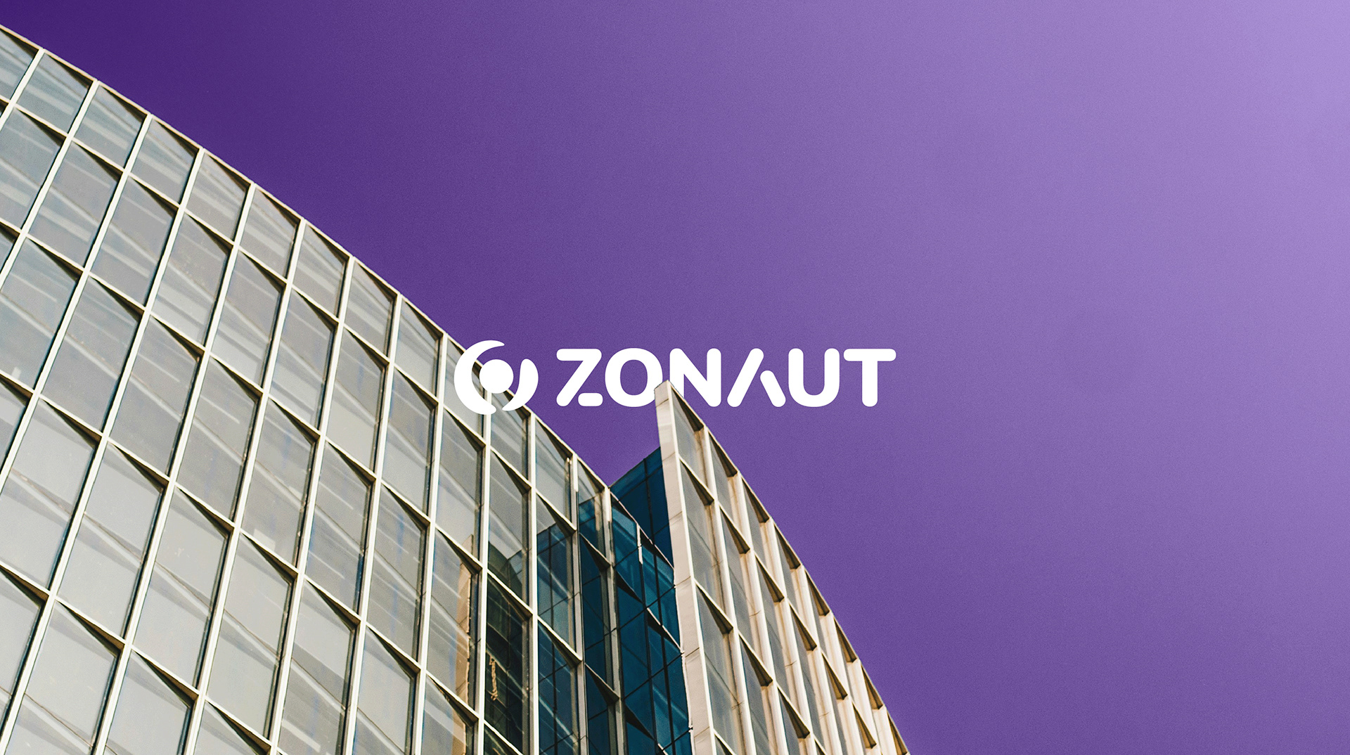
The Zonaut logo is designed to represent deep focus and clarity, core to the idea of "zoning out" distractions to solve meaningful problems. The form balances structure and simplicity, reflecting both technical precision and controlled thinking. Rather than relying on obvious tech symbols, the mark is built to feel intentional and timeless, allowing it to scale across applications while consistently signalling reliability, intelligence, and a problem-solving mindset.
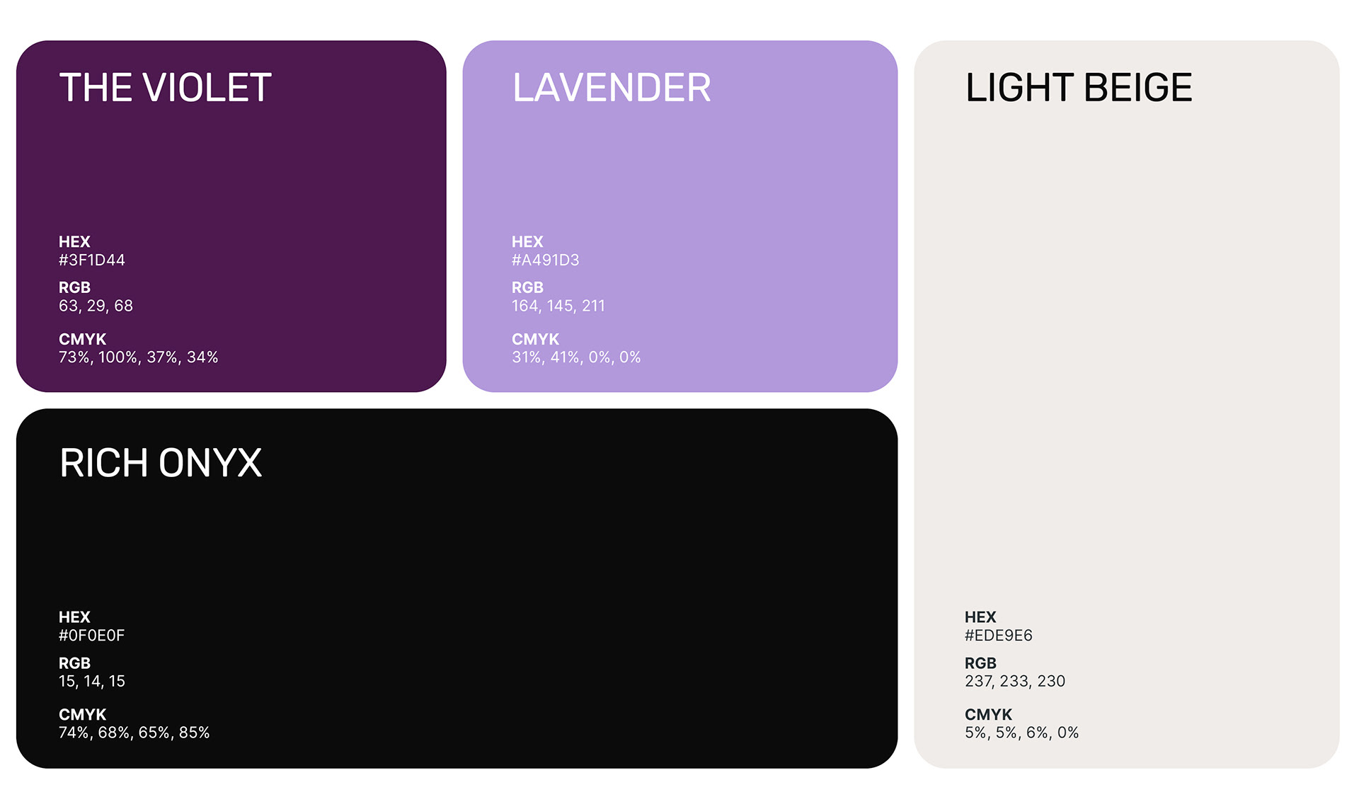
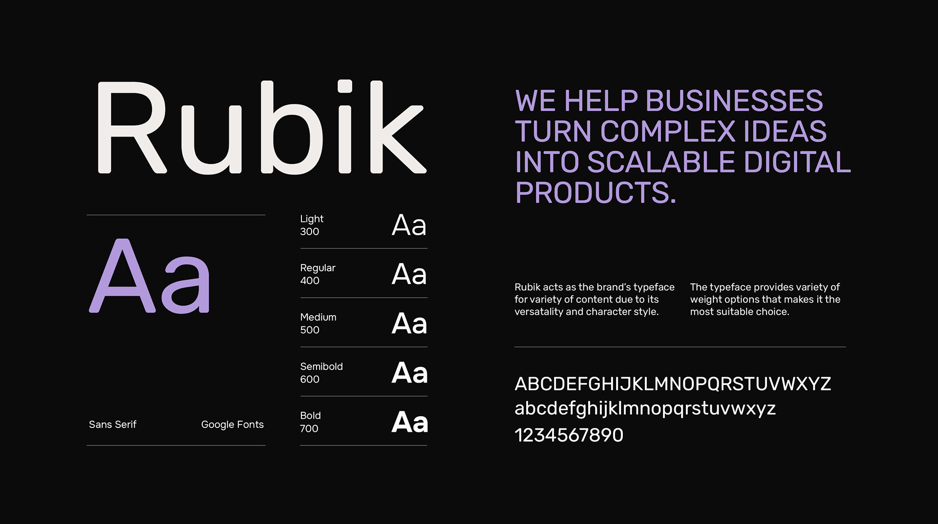
DESIGN DIRECTION
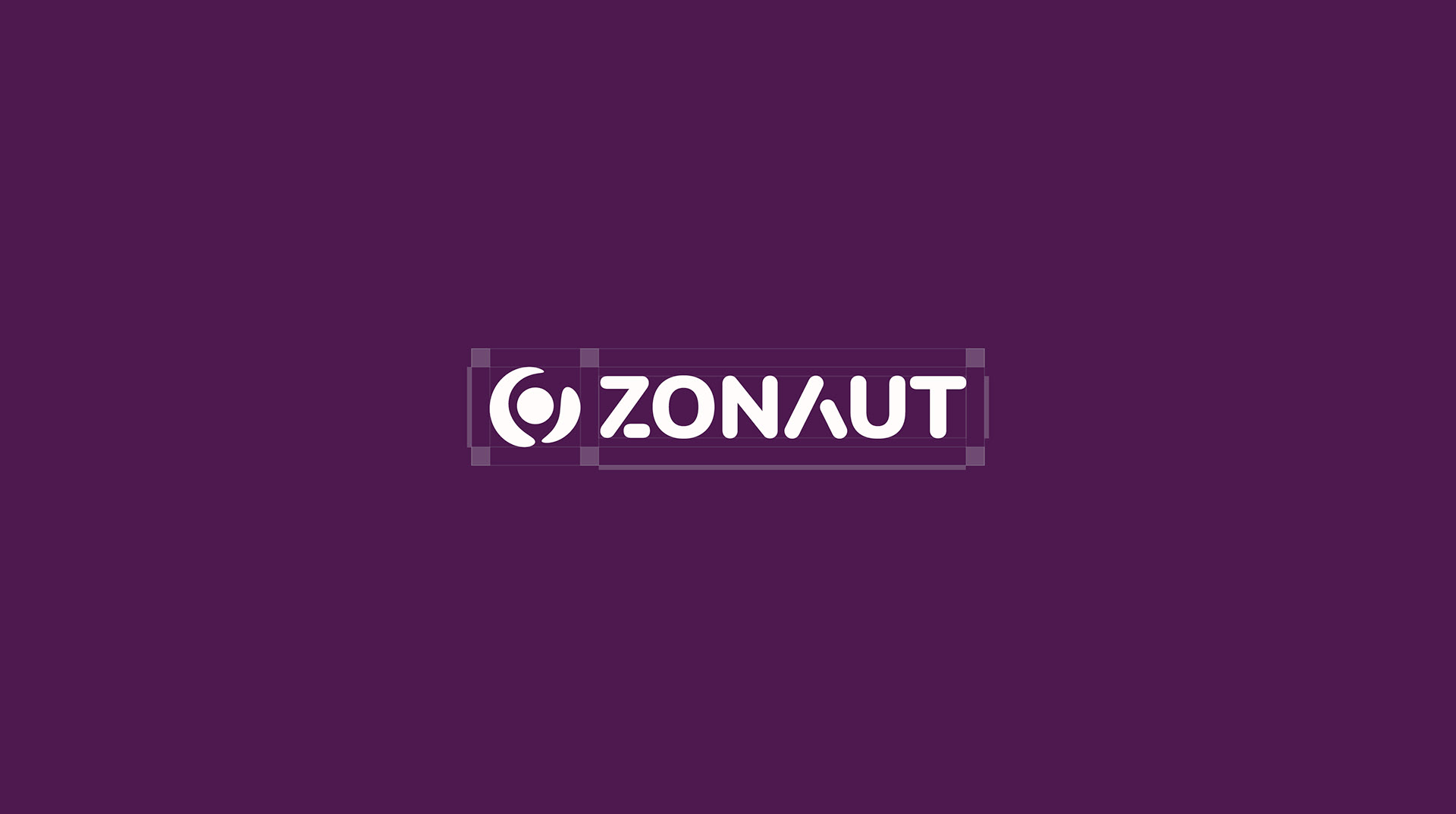
The overall visual identity design is grounded in clarity, restraint, and system-driven design. A minimal yet strong visual language ensures that the brand feels confident without unnecessary complexity, while structured layouts typography reinforce a sense of order and technical depth. The identity is designed to perform consistently across digital platforms, creating a cohesive presence that reflects Zonaut's ability to build scalable, performance solutions with focus and discipline.